Fender American Standard Series is a Diamond in the Rough

Introduction:
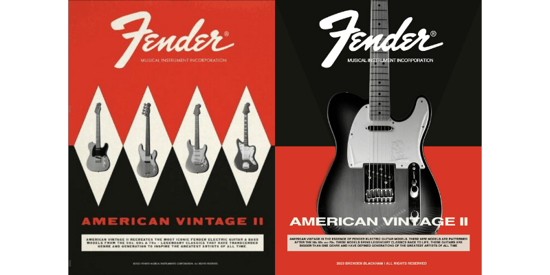
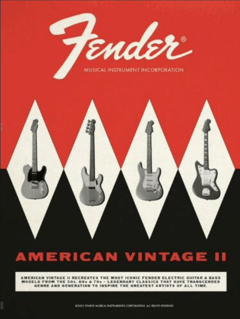
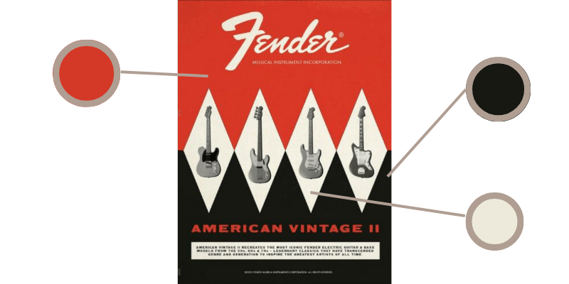
This design was done recently by fender as a nod to their vintage ads, this ad was run in Guitar Player magazine’s February 2023 issue. There is a nod to their vintage electronics ads that they are also using to promote t-shirts here. The style of bringing in their old-school advertising is combined with a modern take on the look of the advertisement.
With all of the styles put forward, it made a powerful and eye-catching magazine ad that even captivates a modern audience. The general appeal to the design goes back to a las vegas casino type color scheme. There is a classy nature to the colors and the designs combined with black and white imagery bring that comfort of something old school and nostalgic to the design.
Old Advertisement - Design analysis:
Contrast:
The light grey that is used for the logos and the background of the guitars adds bright contrast that helps your eyes highlight what is the most important in the advertisement, the guitars. Those dark reds and charcoal colors mixed with a light grey are very pleasing.
Repetition:
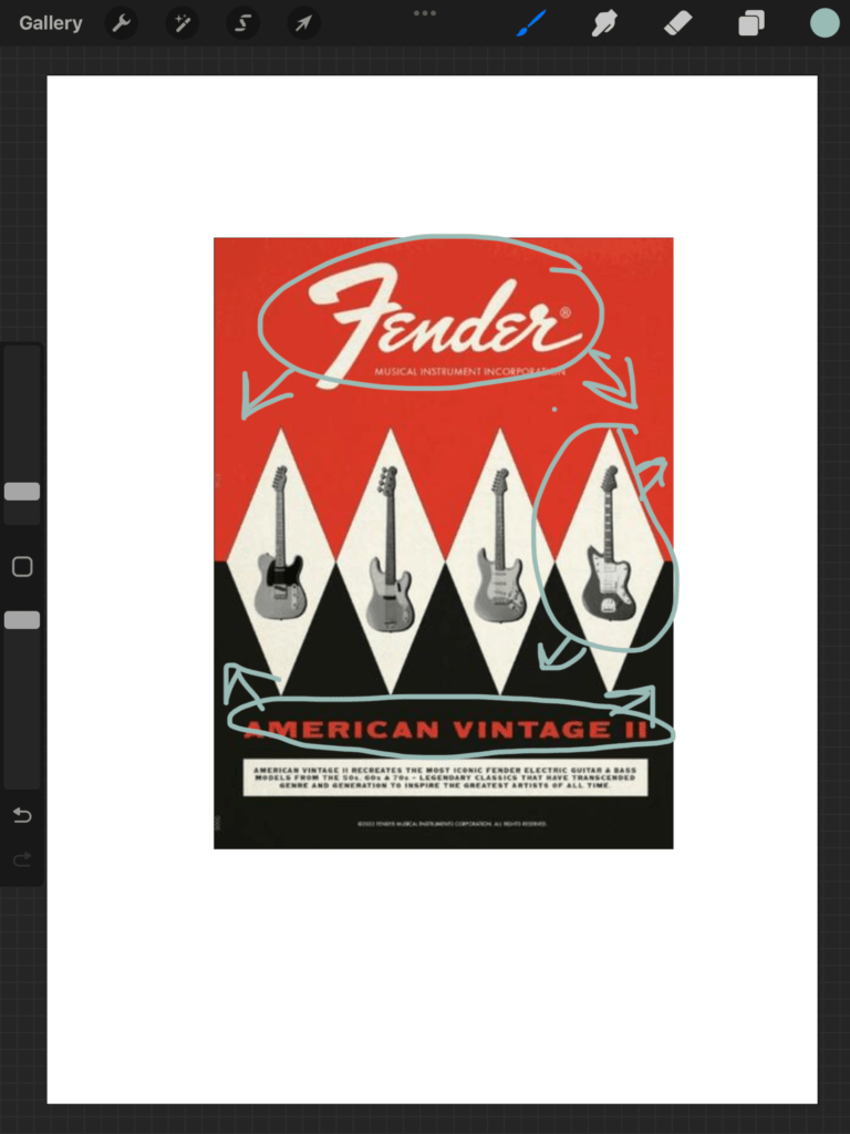
By repeating elements of the diamonds in the background, there is an element of cohesiveness and even though there are 4 guitars instead of groups of 3 or 5, it works well in the overall structure of the ad.

Alignment:
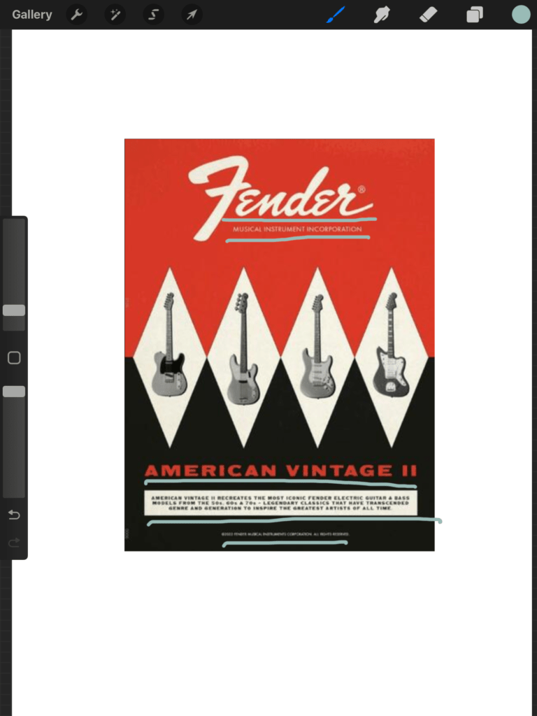
The alignment of the ad is perfect to draw the eye down and read the advertisement, the guitars will be what stands out first if you don’t notice the logo first. By working your way down the page, you get information in the perfect order.

Proximity:
The content of the title of the guitar series is the explanation of the guitar. This helps bring the information to eh proximity of the bottom, the logo at the top adds a lot of breaks up the proximity of the guitars and the closeness of the guitars highlights that this is a series.
Color:
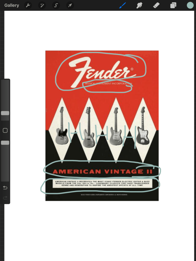
Red attracts the most attention and is associated with strong emotions, such as love, passion, or anger. Charcoal grey is a very formal color and brings a feeling of stability to the design, or stability in the products. Off-white brings a feeling of purity, sacredness, and goodness. These feelings of strong emotions combined with the color psychology make fender something that is passionate, stable, and borderline spiritual.
Typography:
The combination of Fender’s classic logo font and a sans-serif font bring simplicity to a very busy visual design. This helps make it easy to read and brings an interesting feel to the overall look of the design.
New Advertisement Design Analysis:
Contrast:
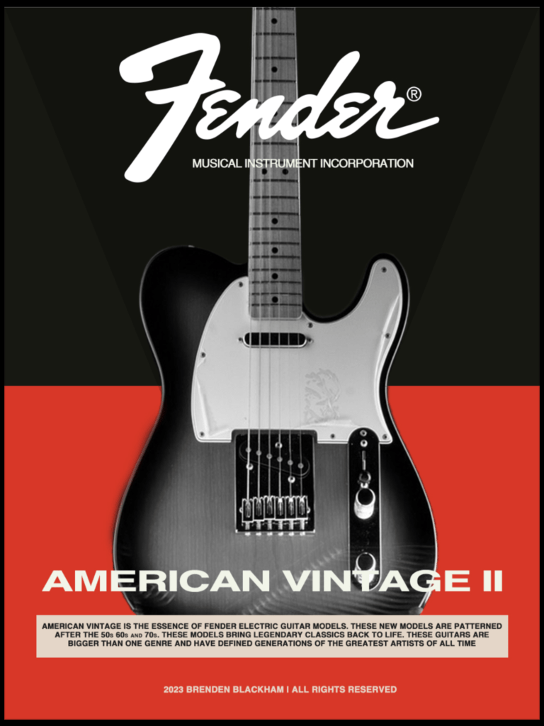
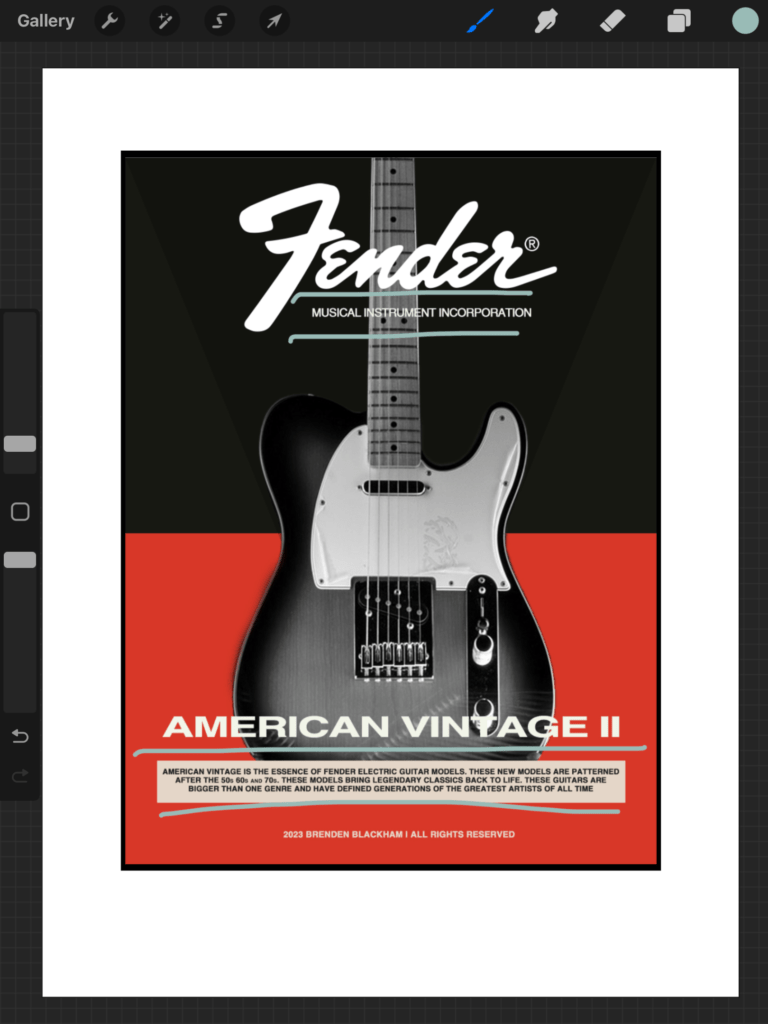
I decided to keep the identical color scheme of light grey that is used for the logo, and the background color, and highlight only one guitar to bring a punch of excitement. Those dark reds and charcoal colors help highlight the pinnacle of this fender telecaster.
Repetition:
The elements that were repeated were the typography elements, there was a visual walkthrough of the same typography for the nitty gritty information which helped bring comfort
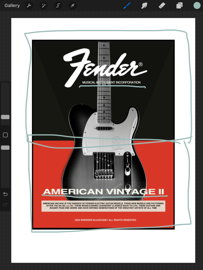
Alignment:
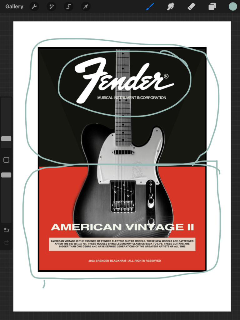
I aligned the written content the same as the original ad, but I used one guitar to highlight and keep that Front and center. It is fun to read more about the guitar at the bottom, but overall the ad is there to highlight one instrument, I felt the 4 smaller guitars were very busy.
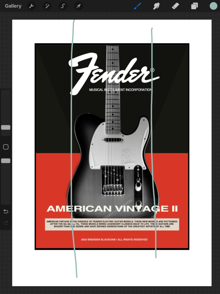
Proximity:
The written informational content at the bottom explaining what can be found in the Fender American Standard series highlights where information was placed in proximity. Because the logo is at the top and pushed in front, it is obvious what kind of guitar this is as well.
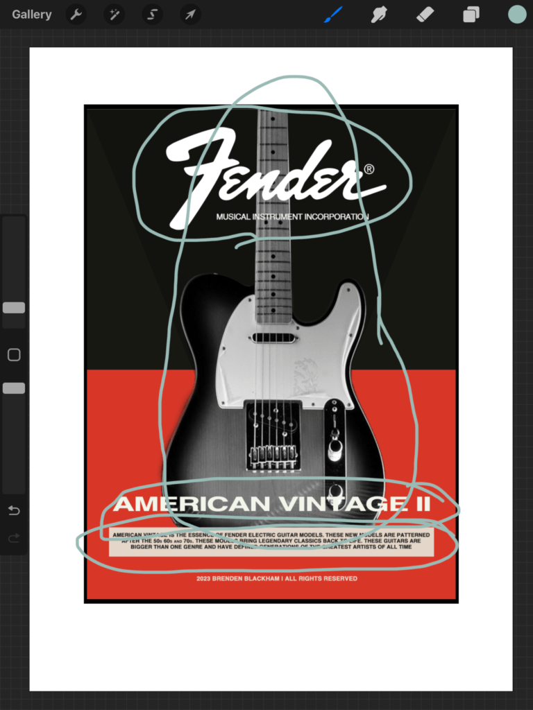
Color:
I kept the same color scheme because Red attracts the most attention and drives passion, Charcoal grey from the top of the ad and the grey of the image is highlighting the stability of the product. Off-white brings a feeling of purity, sacredness, and goodness to the logo. My ad brings more of a sable nature to the product rather than highlighting the color red.
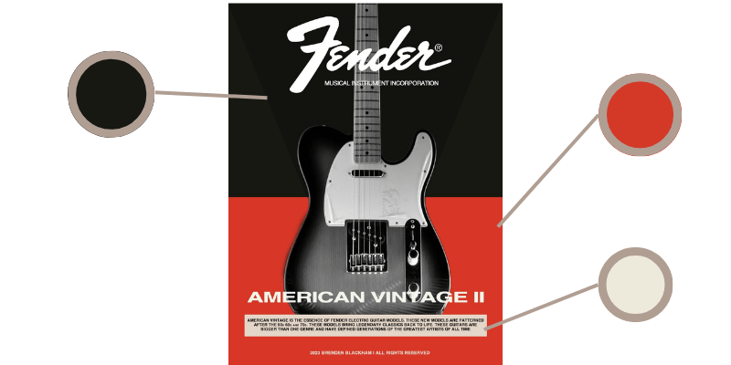
Typography:
I used Fender’s classic logo font and a sans-serif font to bring simplicity to a very busy visual design. This makes it easy to read and the placement of that typography is intentionally important because it brings a better feel.
Conclusion:
These ads would be part of the same campaign because visually they have many similarities, but also they are different enough that different guitar lovers would be drawn to different elements of the creative. In a proper ad campaign, it is important to have variations in the creative because you can see which type of ad would convert better.
